Bank Syariah Indonesia
Bank Syariah
Indonesia
Bank Syariah Indonesia
Users have difficulty with checking the balance
Users have difficulty with checking the balance
UI/UX design case study | Personal project
UI/UX design case study | Personal project


Roles & Responsibilities
Roles & Responsibilities
It's my first time making a case study. I did everything—from Research and Wireframing to Ideation, and Hi-fidelity
It's my first time making a case study. I did everything—from Research and Wireframing to Ideation, and Hi-fidelity
Timeline
Timeline
10 days
August 2022
Q3
10 days
August 2022
10 days
August 2022
Q3
Tools used
Tools used
Figma, Google Form
Figma, Google Form
Disclaimer: This project is not affiliated with BSI
Disclaimer: This project is not affiliated with BSI
About this project
About this project
BSI is an effort for the establishment of the largest sharia bank in Indonesia. As the country with the largest Muslim population in the world has the potential to be at the forefront of the Islamic finance industry.
BSI is an effort for the establishment of the largest sharia bank in Indonesia. As the country with the largest Muslim population in the world has the potential to be at the forefront of the Islamic finance industry.
BSI is an effort for the establishment of the largest sharia bank in Indonesia. As the country with the largest Muslim population in the world has the potential to be at the forefront of the Islamic finance industry.
The Beginning
The Beginning
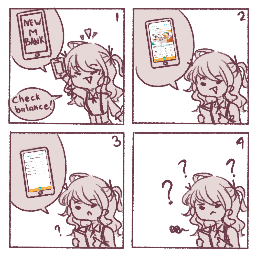
just downloaded a new mobile banking application; however, the design does not align with the standards of mobile banking apps I have used before
just downloaded a new mobile banking application; however, the design does not align with the standards of mobile banking apps I have used before
How might we enable users to effortlessly access checking balances and transactions within mobile banking?
How might we enable users to effortlessly access checking balances and transactions within mobile banking?
How might we enable users to effortlessly access checking balances and transactions within mobile banking?
The Problem
The Problem
Although BSI has launched their mobile product, the features of BSI do not adhere to the mobile banking standards in comparison to other mobile banking standards in Indonesia. Here are some features in BSI that are not standardized like in other mobile banking app.
Although BSI has launched their mobile product, the features of BSI do not adhere to the mobile banking standards in comparison to other mobile banking standards in Indonesia. Here are some features in BSI that are not standardized like in other mobile banking app.
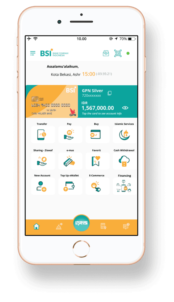
Problem #1: Main menu display
Problem #1: Main menu display
Problem #1 Main menu display
The ads on the screen are too big and become the main focus. Moreover, users cannot see the balance on the screen.
The ads on the screen are too big and become the main focus. Moreover, users cannot see the balance on the screen.
The ads on the screen are too big and become the main focus. Moreover, users cannot see the balance on the screen.

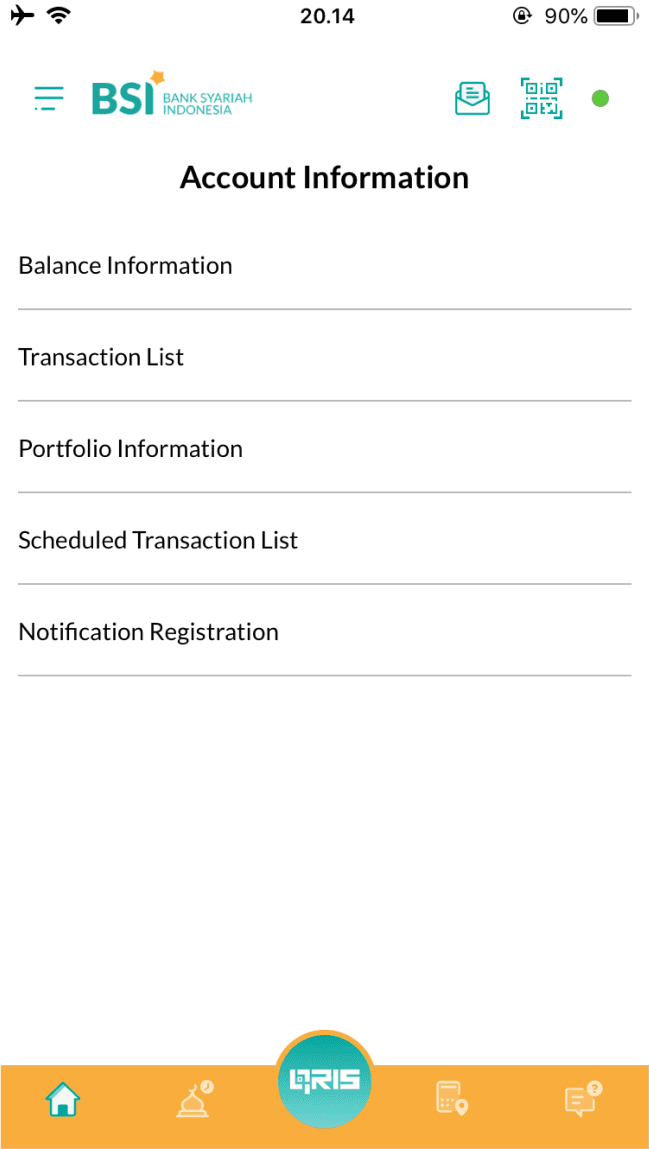
Problem #2: Accessing Account Info involves too many steps
Problem #2: Accessing Account Info involves too many steps
Problem #1 Main menu display
The app fails to show a quick balance check on the main screen. Users must navigate to Account Info, but this process involves several steps, including re-entering the password. Additionally, the design lacks visual engagement.
The app fails to show a quick balance check on the main screen. Users must navigate to Account Info, but this process involves several steps, including re-entering the password. Additionally, the design lacks visual engagement.
The app fails to show a quick balance check on the main screen. Users must navigate to Account Info, but this process involves several steps, including re-entering the password. Additionally, the design lacks visual engagement.
Problem #3: The transaction list is lack of visual
Problem #3: The transaction list is lack of visual
Problem #1 Main menu display
The transaction results list lacks visual engagement and is too plain; users find it difficult to read
The transaction results list lacks visual engagement and is too plain; users find it difficult to read
The transaction results list lacks visual engagement and is too plain; users find it difficult to read

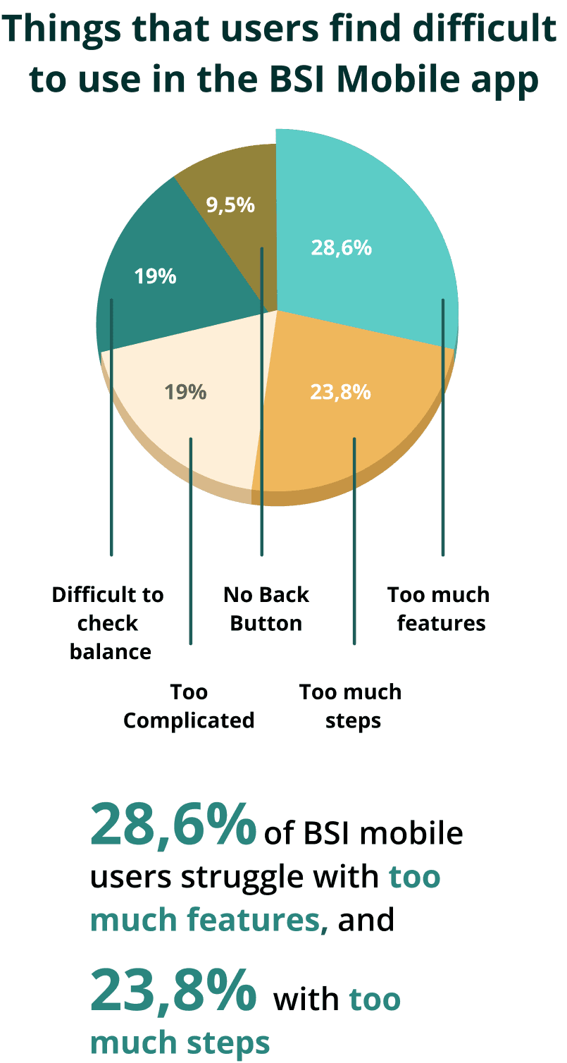
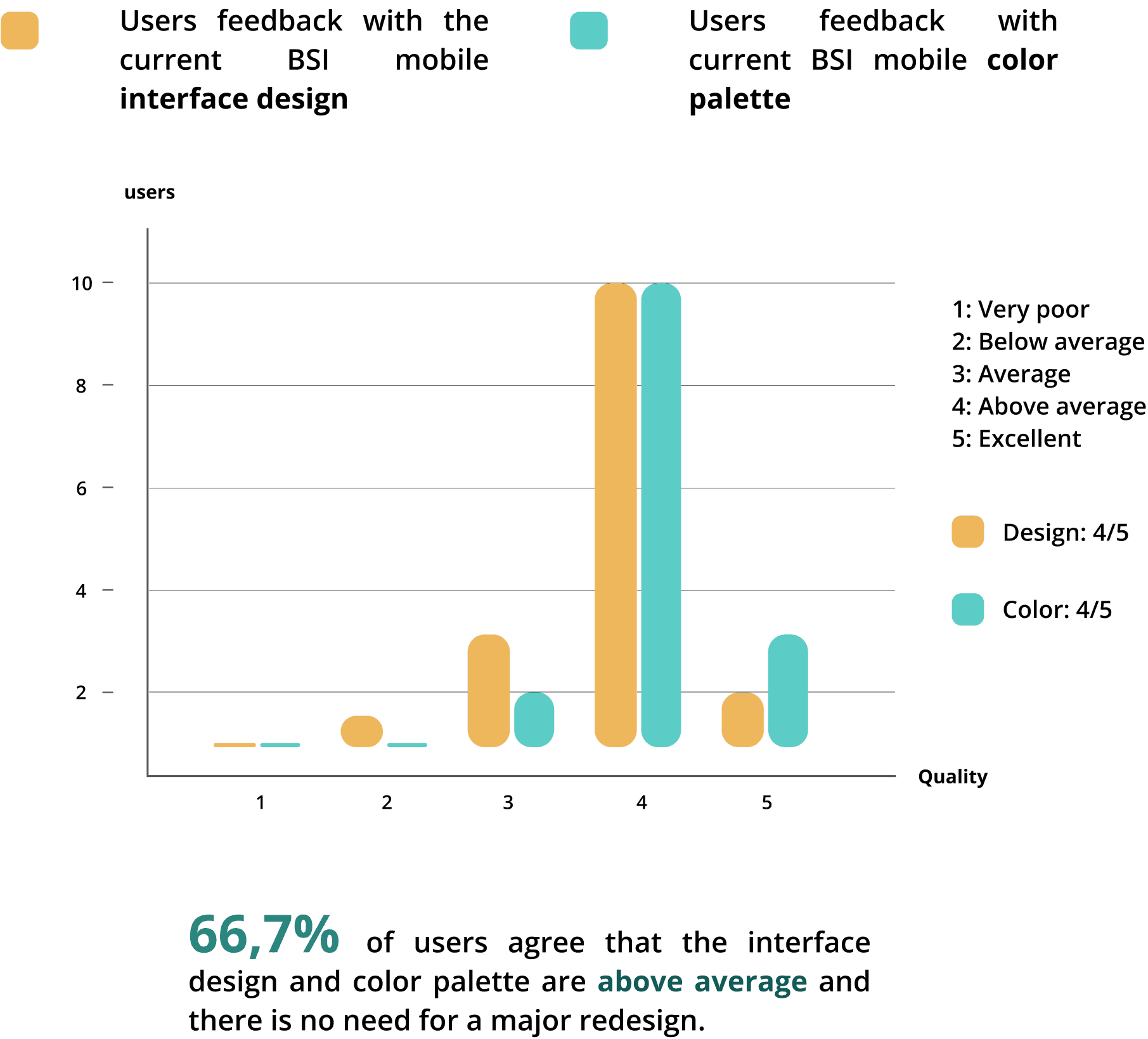
The Validation
The Validation
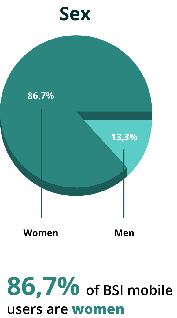
I collected surveys of 15 BSI mobile users via the distribution of Google forms. The quantitative research involved an online survey of 13 questions
I collected surveys of 15 BSI mobile users via the distribution of Google forms. The quantitative research involved an online survey of 13 questions


With advanced technologies, UX must offer the right functions for an easy customer journey and meeting the standards of other mobile banking services.
With advanced technologies, UX must offer the right functions for an easy customer journey and meeting the standards of other mobile banking services.
Project goal
Project goal
"The solution I'm offering is to add several features that align with standard mobile banking practices without significantly altering the design and still following the original design. By making these design changes, I aim to make it easier for users to check their balance, access account information, and view transactions"
"The solution I'm offering is to add several features that align with standard mobile banking practices without significantly altering the design and still following the original design. By making these design changes, I aim to make it easier for users to check their balance, access account information, and view transactions"
Competitive analysis
Competitive analysis
Direct competitor
Direct competitor
Livin’ by Mandiri
Livin’ by Mandiri
Livin’ by Mandiri

Mandiri's main menu includes balance checking; additionally, the card used by the user is displayed on the main page
Mandiri's main menu includes balance checking; additionally, the card used by the user is displayed on the main page
Jenius by BTPN
Jenius by BTPN
Jenius by BTPN

Jenius' main menu includes balance checking, which is placed at the top of the features to make things easier for users.
Jenius' main menu includes balance checking, which is placed at the top of the features to make things easier for users.
Indirect competitor
Indirect competitor
Gojek
Gojek
Gojek

Grab
Grab
Grab
Although not banking apps, both share a common feature: displaying balance checks on the main menu. They avoid placing ads at the top, ensuring users focus on key features.
Although not banking apps, both share a common feature: displaying balance checks on the main menu. They avoid placing ads at the top, ensuring users focus on key features.
Of the four competitors, this is what is considered standard practice. It shows the current balance on the main menu. for security reasons, It is required to set the eye icon password
Of the four competitors, this is what is considered standard practice. It shows the current balance on the main menu. for security reasons, It is required to set the eye icon password
The Solutions
The Solutions
Solutions #1
Displaying balance checks on the main menu
Solutions #1
Displaying balance checks on the main menu
Solutions #1
Displaying balance checks on the main menu
Before: The advertisement on the main menu is too big, making it the main focus rather than other features. Also, there is no quick balance check option on the main menu.
Before: The advertisement on the main menu is too big, making it the main focus rather than other features. Also, there is no quick balance check option on the main menu.
Before: The advertisement on the main menu is too big, making it the main focus rather than other features. Also, there is no quick balance check option on the main menu.
After: Removing the ads and adding a quick balance check on the main menu to make it easier for users to check their balances.
After: Removing the ads and adding a quick balance check on the main menu to make it easier for users to check their balances.
After: Removing the ads and adding a quick balance check on the main menu to make it easier for users to check their balances.
Solutions #2
Access Balance and Transaction History in Account Info
Solutions #2
Access Balance and Transaction History in Account Info
Solutions #2
Access Balance and Transaction History in Account Info
Before: The display design is too plain and lacks visualization; it only presents a plain text list. Also to checking the balance, user need.
Before: The display design is too plain and lacks visualization; it only presents a plain text list. Also to checking the balance, user need.
Before: The display design is too plain and lacks visualization; it only presents a plain text list. Also to checking the balance, user need.
After: The balance is displayed in the account information, also the account information displays the card ID number.
After: The balance is displayed in the account information, also the account information displays the card ID number.
After: The balance is displayed in the account information, also the account information displays the card ID number.
Solutions #3
Optimizing Visibility: Transactions and Scheduled in one screen.
Solutions #3
Optimizing Visibility: Transactions and Scheduled in one screen.
Solutions #3
Optimizing Visibility: Transactions and Scheduled in one screen.
Before: Both of the design lacks visualizations and don't follow mobile banking standard practices.
Before: Both of the design lacks visualizations and don't follow mobile banking standard practices.
Before: Both of the design lacks visualizations and don't follow mobile banking standard practices.
After: Both can be found in the account information. I designed both of them with swipeable edges to make it easier for users to view transaction information.
After: Both can be found in the account information. I designed both of them with swipeable edges to make it easier for users to view transaction information.
After: Both can be found in the account information. I designed both of them with swipeable edges to make it easier for users to view transaction information.
Conclusions + Lesson learned
Conclusions + Lesson learned
With the balance view feature on the main menu, users can quickly check their balance. For added security, I added the eye icon password.
With the balance view feature on the main menu, users can quickly check their balance. For added security, I added the eye icon password.
But also…
But also…
I did my 1st case study 🎉
I did my 1st case study 🎉
The process of creating this case study has taught me that I need to collect a lot of data in order to be more accurate. Furthermore, I did not conduct interviews for this case study.
Before conducting research for this case study, I learned not to make assumptions.
The process of creating this case study has taught me that I need to collect a lot of data in order to be more accurate. Furthermore, I did not conduct interviews for this case study.
Before conducting research for this case study, I learned not to make assumptions.
Due to limited time, if I have time, I will continue a case study that focuses on the overall appearance of the BSI mobile user interface for better user use, which will require extensive research and a significant amount of time.
Due to limited time, if I have time, I will continue a case study that focuses on the overall appearance of the BSI mobile user interface for better user use, which will require extensive research and a significant amount of time.
Future interest
Future interest


